PROJECT OVERVIEW:
For the first high-fidelity project in the UMN Bootcamp, my group chose to reorganize and re-style the National Park Service website in order to improve navigation and make information both easier and faster to access.
ROLE: UX Researcher, UI Designer
TIME: June 2022 - July 2021
TOOLS: Figma, Miro, Slack, Google Suite, Adobe Illustrator
TIME: June 2022 - July 2021
TOOLS: Figma, Miro, Slack, Google Suite, Adobe Illustrator
1. Research and Context
As so many stories do, we start with our main character. Michael is a 42-year-old father of three kids. He loves taking his family on annual vacations and uses the NPS website to get the information he needs to plan trips and find activities.
User Persona
We wanted to make sure Michael has the easiest and fastest ways to get park information. To understand this process and find any pain points, we selected a user path to focus on (detailed below) and performed several rounds of testing to identify issues faced by users of the site.
A note on user paths:
In the existing design, there are multiple paths that can be taken to get to the goal of the test; for instance, the list of parks in Minnesota can be reached by selecting Find a Park and clicking on the map or by selecting Minnesota from the dropdown.
One goal of our testing was to identify what paths seemed the most intuitive, so we asked several users to repeat the test using different routes to compare time and completion rates and gain qualitative, "stream of consciousness" feedback during testing.
In the later analysis stage, we compared the data on this to simplify the redesigned flow.
All testers were able to complete the flow in varying times, but over half were sidetracked along the way or had difficulty locating the information they needed without going back to previous pages.
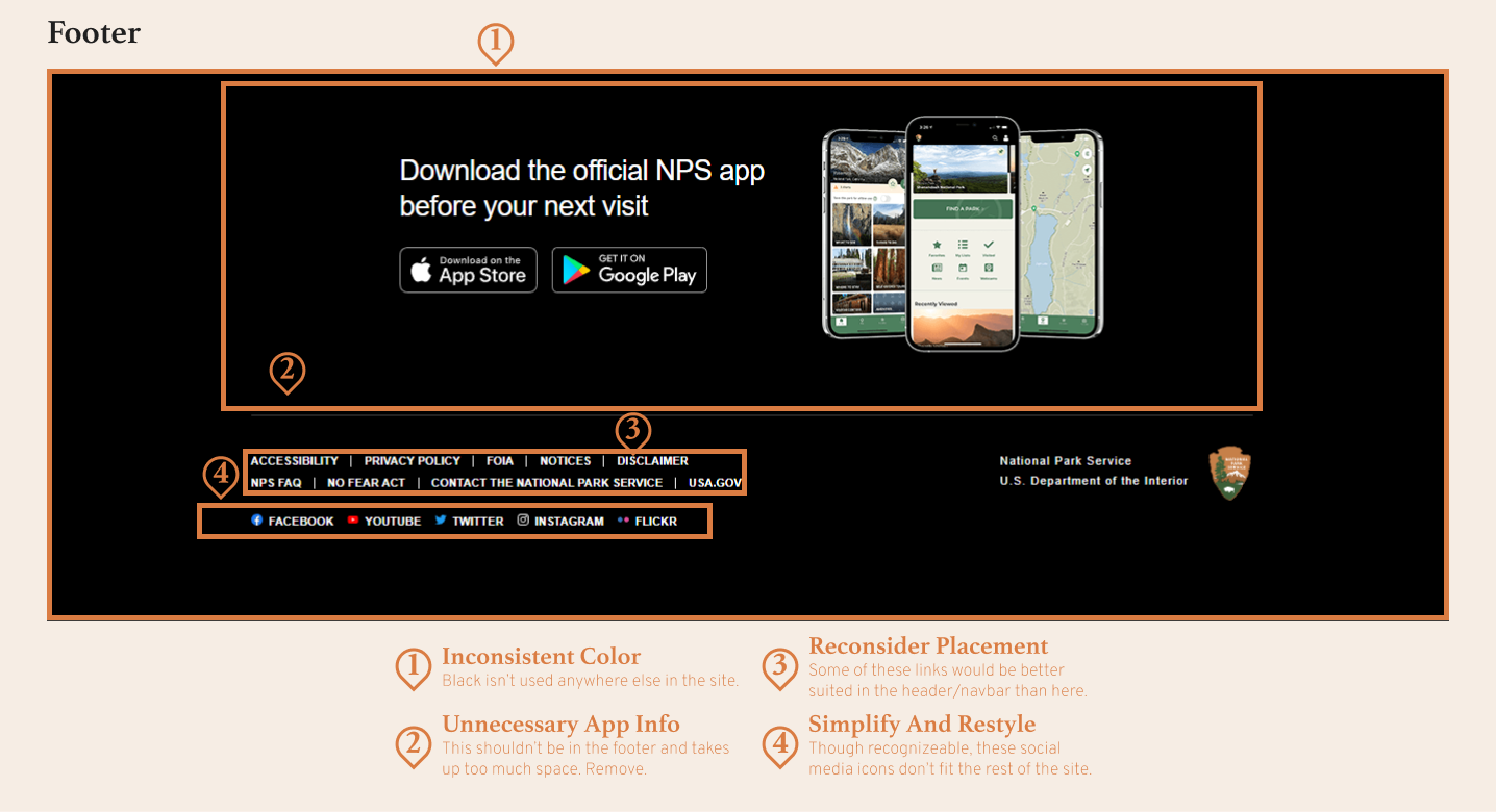
Additionally, we conducted an internal heuristic evaluation which identified several problems, namely unclear navigation and a heavily cluttered and inconsistent interface.
2. Analysis and Ideation
From our external user testing and internal design analyses, we determined that our primary goals should be to reorganize existing menus and page sitemap to improve navigation, rebuild informational hierarchy to facilitate easier and faster comprehension, and centralize key information to reduce clicks and "page-digging" when planning visits. The in-depth analysis of each page in our target user flow has been left out for the sake of brevity.
Note:
At this point in the project, all groups split. All work from here on was done individually.


Navigation Analysis:
The first task was to analyze the existing navigation. I identified several changes that needed to be made, primarily to do with inconsistency in styling and naming convention as well as confusing options due to poor organization and excessive choices.
Card Sort:
I performed a card sort on the existing pages in order to build a new sitemap. The goals were to rebuild the categorization and to rename page titles to clarify their purposes.
The updated card sort was easily turned into a new sitemap by applying the prioritization from user testing to the new categories and grouping. Much of the order remained the same as the existing site, but some was changed based on the identified needs of users.
Rebuilt sitemap:
3. Prototyping and Design
This section is still in progress and will be fully written soon.
Style guide and color accessibility test
Navigation elements - mockups
Wireframes - Desktop


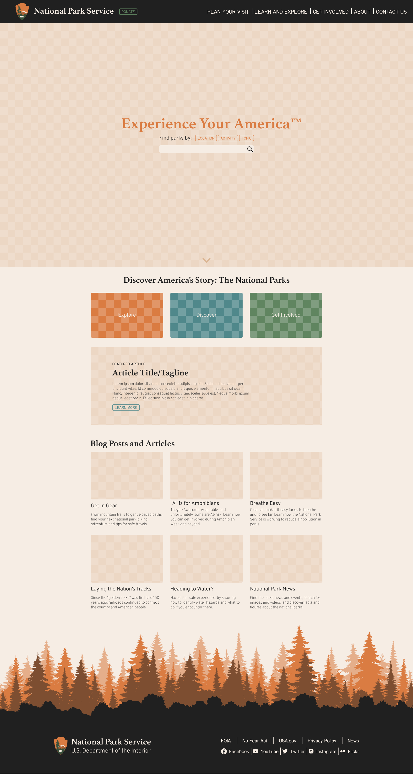
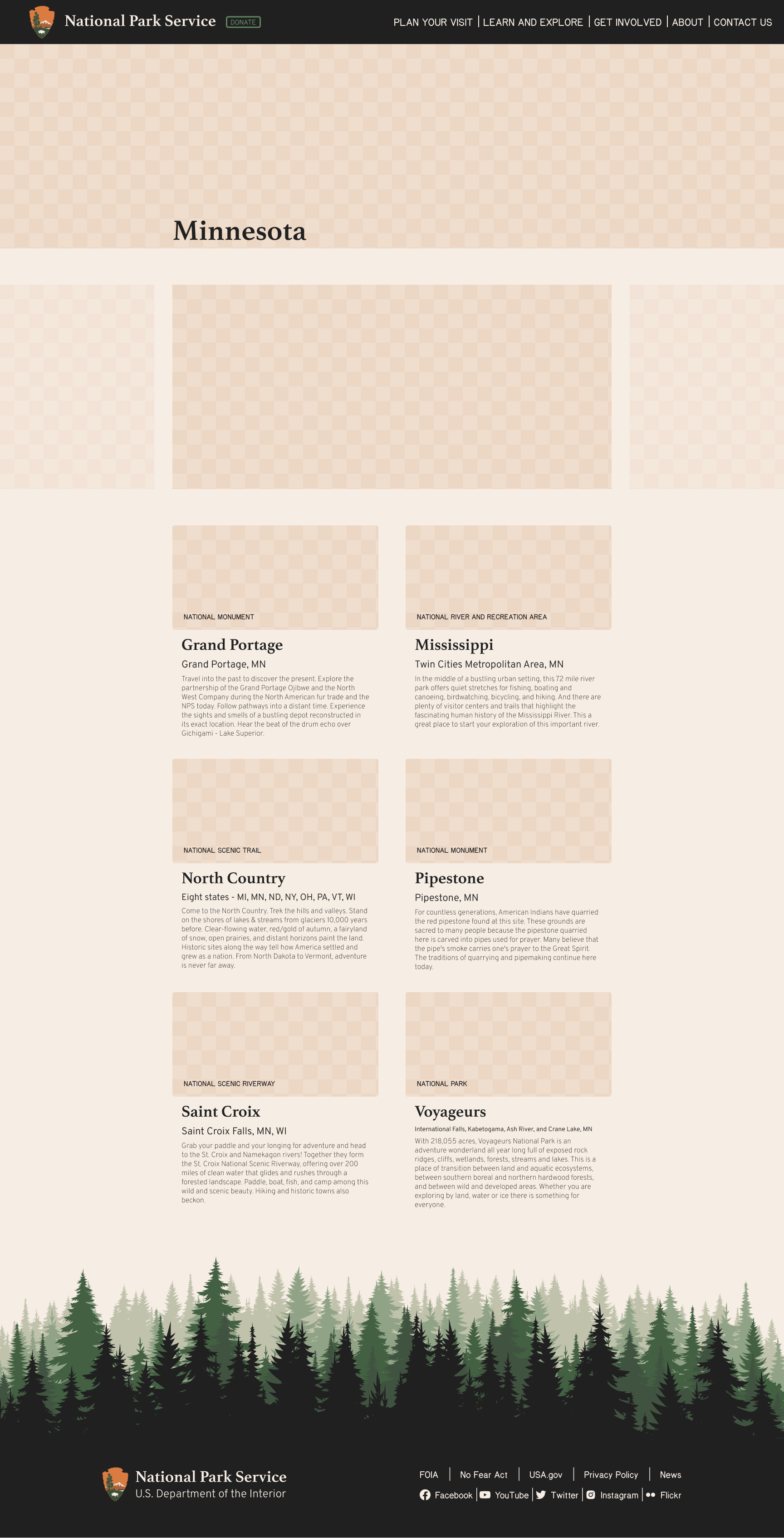
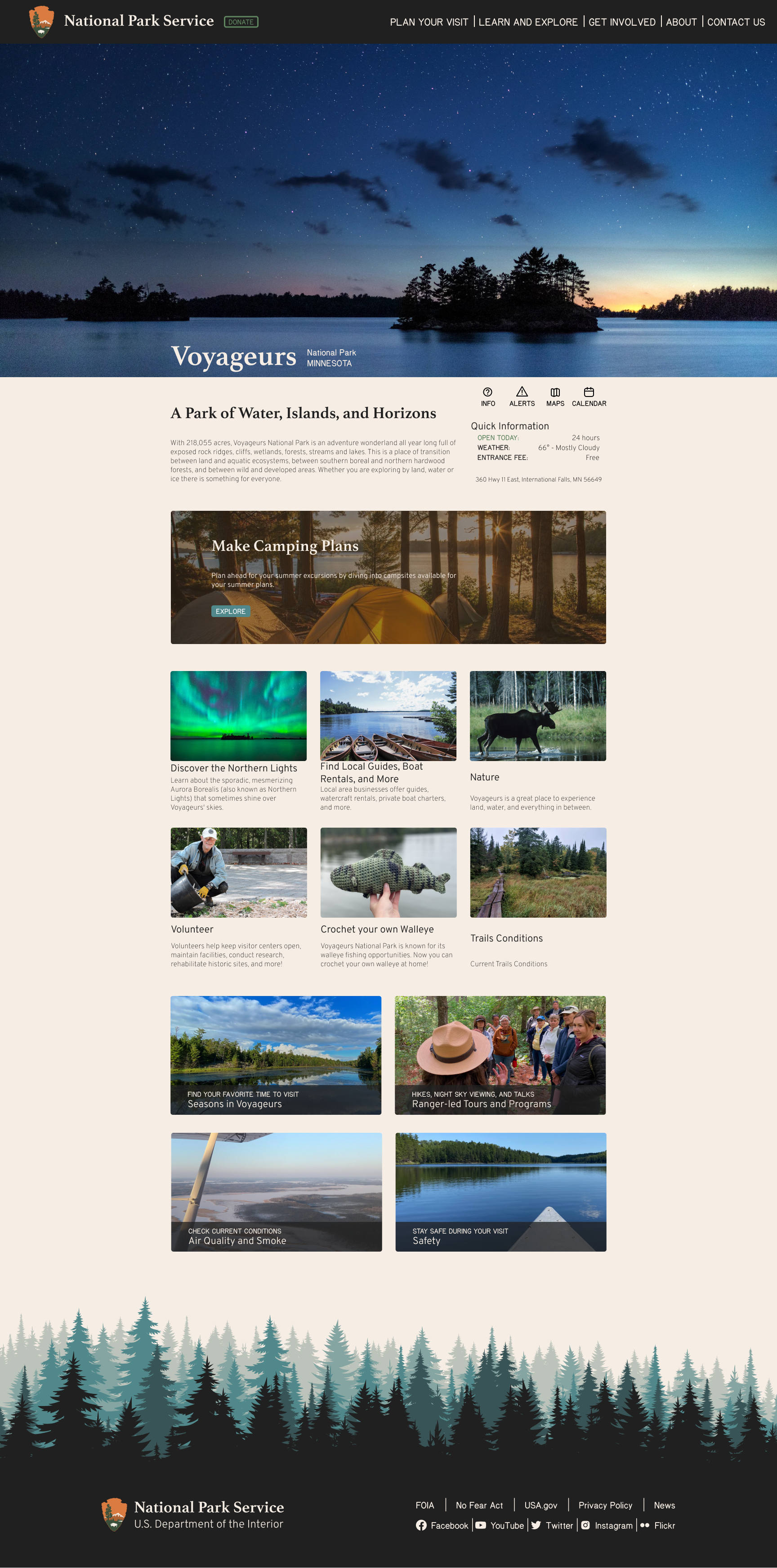
High-fidelity mockups - desktop and mobile


Final Comments
This is, in my opinion, my most complete project by far. While all projects before and after were certainly done to the extent set by their briefs, this was the first that was followed through the high-fidelity stage and was primarily done individually rather than in a group.
If I had had more time, there are definitely changes I would have made; to name a few, the navbar and mobile menu weren't iterated beyond the initial mockups and could do with stylistic improvements, the Minnesota results page would benefit from reworking the above-fold section and replacing the photo carousel with text to engage users and provide more information or guidance, and several info and article cards are in need of content improvements.
Critiques aside, though, I feel this project best showcases what I learned in the UMN course; I was able to utilize skills in user testing, analysis, and iterative design to reach an end result that I'm greatly satisfied with.
